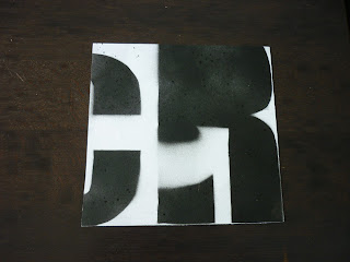
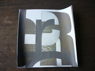
I found it hard to choose my final four - especially the photographic image composition, but here they are:
1. Composition that meets the guide lines of the brief:
2. Composition that I think is cool:
3. Stencil composition:
4. Photographic image composition:
LRCY1Studio
Wednesday, 4 April 2012
10. Photographic Image Compositions
I created these compositions from photos of my large stencil sheets then in Illustrator I put type over top and made a clipping mask to fit the 180mm x 180mm template.
I focused on the shapes I could find in the counter form rather than trying to make a perfectly balanced composition. I see them as beautiful chaos.
Tuesday, 3 April 2012
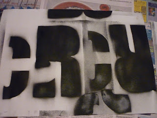
8. Spray Painted Stencils
Spray painting is really fun! I finally bought some spray paint and used large sheets of paper to put my stencils on. I did the stencils letter by letter without a composition in mind because I wanted to see what would happen if I did it randomly like this. I then cut out the large sheets of paper into the 180mm x 180mm squares - I looked for an interesting part of the sheet so this was chosen by me and not at random. I like the messy layered look and the texture created (by not being able to control the can well). I think it's great to experiment with different medias to see what different possibilities appear - it's really refreshing and I'm learning a lot.
The above is my favorite composition. Maybe the C should have been placed lower down but I think it still works with the flowing counter shape arrow coming down from the top left and then turning up towards the top right.
I like the composition above because of the arrow counter shape directing the eye from the 'c' on the left to the top Right of the 'r'.
I like the composition above. The eye is lead diagonally from the top left hand corner to the bottom right.
I liked this composition so much I made it again but neater.
Subscribe to:
Comments (Atom)


