Exploring the unique forms and poetic compositional potential of the letters from my initials - LRC.
First I tried the typeface Bodoni. I wanted to see what shapes of interest appeared by placing the letters in different positions. I wanted to do this before using the 180mm x 180mm template for the final compositions:
.jpg)

.jpg)


.jpg)


.jpg)
.jpg)


.jpg)

.jpg)
.jpg)
.jpg)
.jpg)


.jpg)
.jpg)

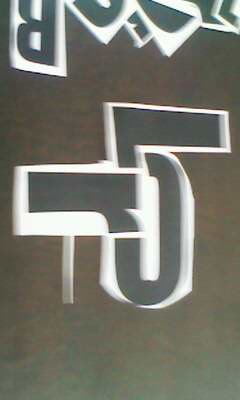
I then tried the font Impact. At first I didn't like Impact but once I started to experiment with the different letters I found it created nice fat bold shapes:
.jpg)
.jpg)

.jpg)

.jpg)


.jpg)

.jpg)
.jpg)

.jpg)

.jpg)

.jpg)
.jpg)

.jpg)
.jpg)

.jpg)

.jpg)
.jpg)

.jpg)


.jpg)

No comments:
Post a Comment